Figma Style Unifier
Design system-builder and linter
Unify style parameters throughout your figma layout for better design consistency. Convert your intuitively designed first layouts into propper yet highly effective design systems. Or just fix your final design with your existing styles. Find inconsistencies or unlinked elements easily. Swap themes or incorporate external components and adapt them to your local or global styles in a breeze.
Figma Style Unifier
Design system-builder and linter
Required: Mac OS 14+, Windows 10+, Figma 2023+
Plugin-Version: 1.0.0
FREE – 29,00 €
excl. VAT
/// Features
Design system building
After finishing your first defining layout frames intuitivly and innovativly, without using style-presets, you can start to craft your unique design system with our style unifier plugin. In the end your system will only have the styles you need. It will be highly effective to work on all subpages and future extensions of your layout. This also works when you kick-start your design process by using a layout or template that does not use a design system.
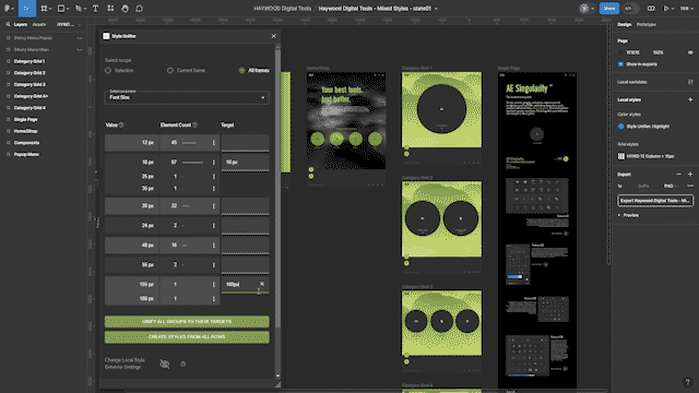
Set the scope to all frames and select a parameter. The best to start with is font size. Then hover over each value row. As you do so, the included elements are highlighted within your layout. Check for ones with low element counts or too similar values. To remove those unwanted similarities you first have to join two or more value-rows into a value-group.
You can do so by cutting and pasting a row, above or below an other value row, and then setting their target value. You could now unify this group directly, but it is better to first do all your grouping, and later unify them all at once. Another way of grouping multiple rows, specially when they are allready consecutively, is to use the join with group below action. Once all groups and targets are set you can easily unify them by clicking on the button: unify all groups to their targets.
Repeat that for each parameter.
As soon as you have created a unified, dynamic and harmonic set of element values in each parameter, you can easily create your set of local styles.
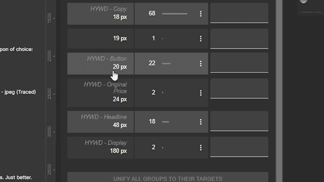
Return to the font size parameter. As now each row here, with all their internaly connected font parameters, represents a style in your design system. In rare cases you might want font styles that share the same font size but have differeing subparameters to be different styles in your design system. For these cases we off there function: split by differing parameter. But this is not the case here. Now to actually convert them to become figma local styles you just need to click on the "Create styles from all rows"-button. You will see them appear in the local styles panel where you can give them your own naming convention.
Creating styles from the colors in your layout is even easier. Check if you unified them enough and then click "Create styles from all rows", rename them in the Color styles panel and you are done. Then connect your stroke colors to those new styles. Use our targeting system and you will see the local styles in the color color picker. That way you can easily connect them with the value groups by using the unify all groups to their targets button.
You made it! You distilled a unique design system out of a few frames, with only the styles you need. It is easily extendable and highly effective for all future work on your project.
Watch the featurette
Design linting
When working with existing design systems, there are allways situations where your file includes elements, that are not connected to the system. That's where the linter functionality of our style unifier plugin comes into play.
Simply run the plugin with the scope set to all frames and select the central font parameter font-size. Then check if all values are connected to a style. If not, decide to which existing style you want to unify that orphant value to. Use our hover-to-highlight-on-canvas feature to check which elements belong to the row of the orphant value. If you want to merge that orphant value with an existing value row that is allready connected to a local style, you first should group the two value rows. Then use the targeting tool to select the style and finaly trigger the unify group action in the three-dots-menu.
In case you discover that an orphant should become it's own style, just use our create style from group function in the 3-dots menu. Once this is done, you can be sure that all your font elements are correctly connected to a style. Now repeat the process with the colors, which is much easier as a color style has no sub-parameters.
That's it! You fixed your layouts and now can be sure that all elements are propperly connected to your design system.
Watch the featurette
Style matching
You need to match the styles of new elements to your design system? Here is how you can do that quickly with our style unifier plugin:
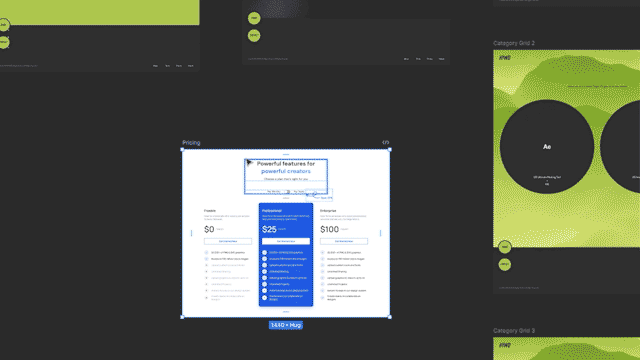
Let's say you want to merge the styles of this section to your layout. If the core color scheme of the new section needs to be inverted, you can easily do this with the free plugin called Dark me. Either click dark me or apply full inversion, depending if you want to switch to a dark or a light theme. Once this is set select the new element. Best way to do that is by placing it into a frame and selecting it. Then open our plugin panel and make sure you set the scope to current frame.
Now start by selecting the first font paramater: font-size. Hover over the value rows to check which elements in your new section get highlighted. Then unify them to the most corresponding font style of your design system. In some cases you do not want to only rely on the font-size parameter to define, to which style the related elements should be unified to. In that case you can either switch to another parameter and continue the style swapping there or use our split by differing parameter function, to stay within font size and finish the style transfer process.
Now that you have gone through each of the parameters that way, you can switch to the color settings and start matching there.
Once this is done aswell, you can be sure you completly matched the new element to your design system.
Watch the featurette
Feature Overview
For a detailed overview of every feature check out the complete walkthrough featurette.
It contains these chapters:
Scope and parameter selection
The table functions:
Value Column
Element Count Column
The 3-dots Button
Target Column
Color panels
Create Styles
Display options
Local & global styles
Resizable plugin panel
Watch the featurette
/// Tutorials
Quick Intro
•
1:48min
Best workflow for
Design system building
•
3:34min
Best workflow for
Design linting
•
1:42min
Best workflow for
Style matching
•
1:37min
Complete walkthrough
•
6:10min
/// FAQ
-
What license types do you offer? Is there a free version?
We have a 7 day trial version which includes the full functionality but expires 7 days after you first activated the license. Our Single active license key version is meant to work on one machine. But you can always release the license lock to that machine by going to the license manager of your shop account https://haywood.tools/my-account/license-manage/ click “LICENSE MANAGE” under the “Actions” column and on the next screen click “DEACTIVATE” in the “Action” column. Now your license is free again to be locked onto another machine. But you can always only use that license on one machine simultaniously.
And we have more than this! Check out our other tools from these host categories:
After Effects
Figma
Unreal Engine